So far the dining room has been completed, the downstairs hallway (pictures below), the downstairs bathroom (I'm already wanting to re-do it, go figure), Griffin's bathroom and Griffin's bathroom part 2, Griffin's bedroom, Grady's room, and Graham's room. It seems like a lot when I look at what's gotten done, but then I look around my house and realize that there is sooo much more still left to do!!
Part of me thinks that I should have just started downstairs and done all of that first and then worked my way upstairs. I guess in reality I've done what gets used the most and where the most people see. In keeping with that theory, the kitchen and family room need to be next.
:: sigh ::
Why do the two biggest and hardest rooms need to be next??
I envision this summer to be filled with late nights, and long weekends. (Bobby, honey, if you are reading this post would you just pack up all 3 of our boys and go stay at your mom's house for a weekend so I can get those rooms done?? :)
Ok, enough blabbering on my part. Here is the hallway!
The above two pictures are from two different vantage points. Please pardon the boxes in the dining room. Spring cleaning has evolved into summer cleaning now :).
The next two pictures above are just some fun accents I added to go around our front door. I have a serious addiction to anything canvas right now. I feel like it makes my house more personalized. Quick side question for ya'll.... Notice my front door is a bizarre shade of ummmm, light green? Would you paint the door white or black? The outside of our house is a very light grey brick. I'm thinking that this door being white would get very dirty and really wash out the outside of our house. I love the idea of blacks and tans together with pops of color around. Hmmm. I might have just talked myself into painting this door black :). Thoughts on this ya'll??
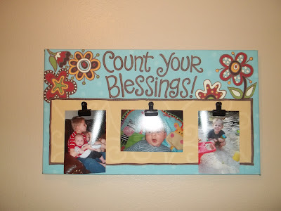
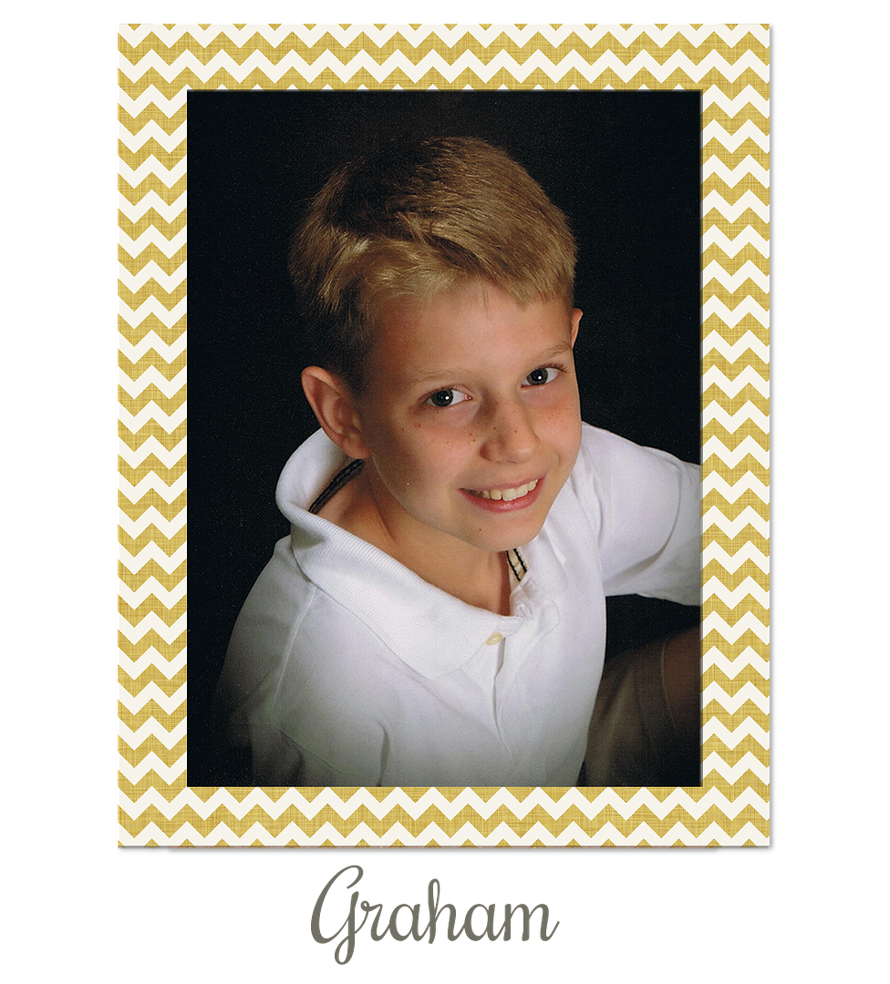
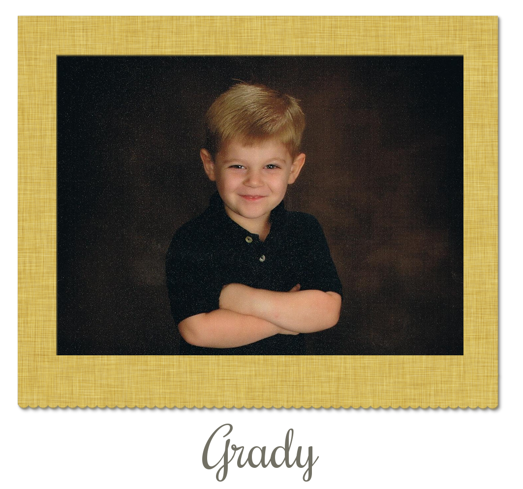
I had a couple of spaces in the hallway that needed just a little something. I think I found some really cute stuff! The first portrait we just had done of the boys! I think it turned out really well. They were all really cooperative that day for the pictures! The second picture is just a fun little tin bit that I had hanging around. The third picture is a fun canvas picture holder that I picked up last week. I am in LOVE with it. I had my eye on it for quite a while before I got. Yay for restraint! :)
In case any of ya'll were wondering here is the difference in the paint. Left side - nasty, dirty white paint. Right side - clean, wipe-able, hint of color.
Ok, now that ya'll have endured 8 pictures of one hallway :), I need some opinions on my stairway.
I know that I'll have to pay a professional to take care of the painting here. The ceiling are probably around 20 feet high and neither Bobby or myself is getting on a ladder to do this. That said, I decided to go ahead and hang some pictures in the stairway. ( This is a HUGE thing for me. Normally I refuse to hang anything until the painting is done because I hate to stress about hanging only to have to take it down and then re-hang again later. Whew. Glad I got that out of the way :)
Let me start off by saying that our stairway goes up and then curves around. What you are seeing is just the first half of it. Please do not look at the deflated blow-up air mattress on our stairs. It has been there for months and will continue to stay there until my very sweet hubby moves it for me. (I am convinced that there are flesh colored lizards living under there and so I refuse to touch it. That story is for another post.)
The blue tape you see is me marking off the distance of how far apart the nails need to go (each picture takes 2). It also serves to set the distance and slope between each of the pictures. After 47 tries, one level, one measuring tape, and 6,000 cuss words I finally got them even.
My problem is this... when I hang them at what would be considered a normal level (with me standing on the ground floor) they would be about waist level to someone walking up the stairs. That's just weird looking. If I hang them at what would be considered a normal level while standing on the stairs then they look insanely high while standing on the ground floor.
Case in point...
See how high they look up! Poor Griffin is up so high that he's actually hanging above the ceiling line for downstairs! But, when I am standing on the stairs below Griffin, he is right at a good chest/shoulder area on me.(Please also do not notice then line of sticky Grady hand prints on the wall. For whatever reason he feels like he must touch the wall every.single.time.
Here are just some random perspective views from the mid-way landing.
When I am walking up the stairs they look perfectly normal to me. It's only when I am downstairs looking up do they look funny and off. Randomly can I also just say that I am afraid to hang them lower for fear of Grady jacking with them when he walks up the stairs...
What the heck would you do?
Hope ya'll enjoyed this little tour of what's been going on in our house lately!








8 comments:
Paint the door black! It would look great!
I agree, paint the door black!!
I think I'd hang them so they may look odd when you are standing at the bottom of the stairs, but so that when you are walking up the stairs, they look totally normal. While people may think them a bit odd when they are at the bottom of the steps, I would personally think that they were just a stairway decoration and didn't need to look "normal" at the bottom of the stairs. Just my opinion!
The house is looking GOOD!
I love your enthusiasm and ideas for your house... looks like it's all coming together beautifully :)) Thank you for your comment on FB... going to try keeping myself busy reading this morning... so will know more later. Love to you always xoxo
I have no advice regarding the pictures, but your tape thing? Brilliant! So stealing that because I am the worst picture hanger in the history of ever!
I am, however, IN LOVE with all your crosses!! That looks amazing!!
It all looks so soo sooo good!! I love the frames and I think it looks good how it is. I do plan to stop by soon to check it out. =)
I say mid point in the pictures they do not look to high from the floor but maybe that is just the way I am looking at the picture. I say black door! I love the frames and the sweet pictures!
looking good!!
leave the pics alone..lol..they look great!!
You my friend, have been my laugh for this Saturday morning!! I have loved your humour in the last two posts to the point of outwardly laughing whilst reading :) Firstly, let me say, that things often sit in the one spot for A VERY LONG TIME (I may just have to post about it) and it becomes a permanent fixture. If I thought there were lizards under that thing I wouldn't be lifting it either lol that's what men are for (sorry Bobby 1 and Bobby 2).
Your picture hanging skills are so much better than mine, I never would have thought of using tape to measure, instead I just keep putting tiny holes in the walls until I finally get it right lol
You are pure genius!
And I think your frames look perfect where you have them, you are never going to have them hanging perfect in your own eyes, but you are working with a tricky spot so you've done well :)
I love the grubby fingerprints up the wall, it adds character lol and reminds me of my home :) xo
Post a Comment